Who EE.
What launch eSIM data plans for inbound UK travellers.
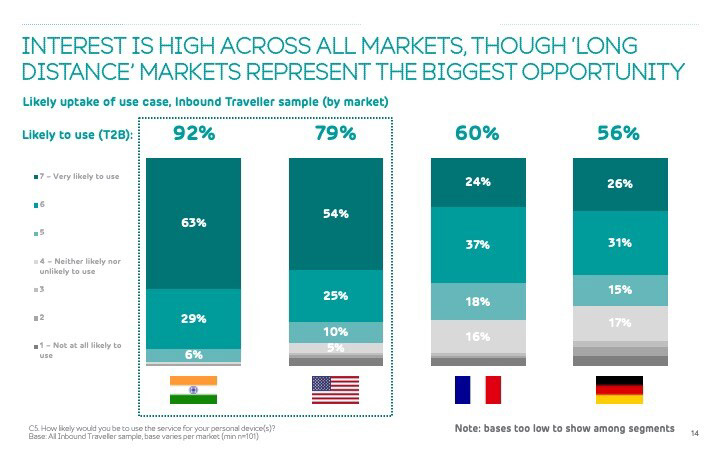
Why An estimated $737m global revenue was made from roaming eSIMs in 2023. 60% of people arrange connectivity ahead of travel, 40% when they arrive; we already serve the 40% with an existing SIM local proposition.
The opportunity is to target the 60% of ‘organised travellers’ with digital presence.
My role on this project was to discover the product space and current market, learn about the business proposition, and design an effective user journey with clear, concise UX that guides the user through a seamless journey.
Discovery
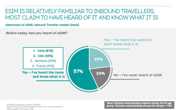
I used a combination of current research obtained from our Roaming squad and previous eSIM projects, as well as new research.
We dived into competitor research, looking into the growing market of travel eSIMs.
I facilitated design workshops to cover:
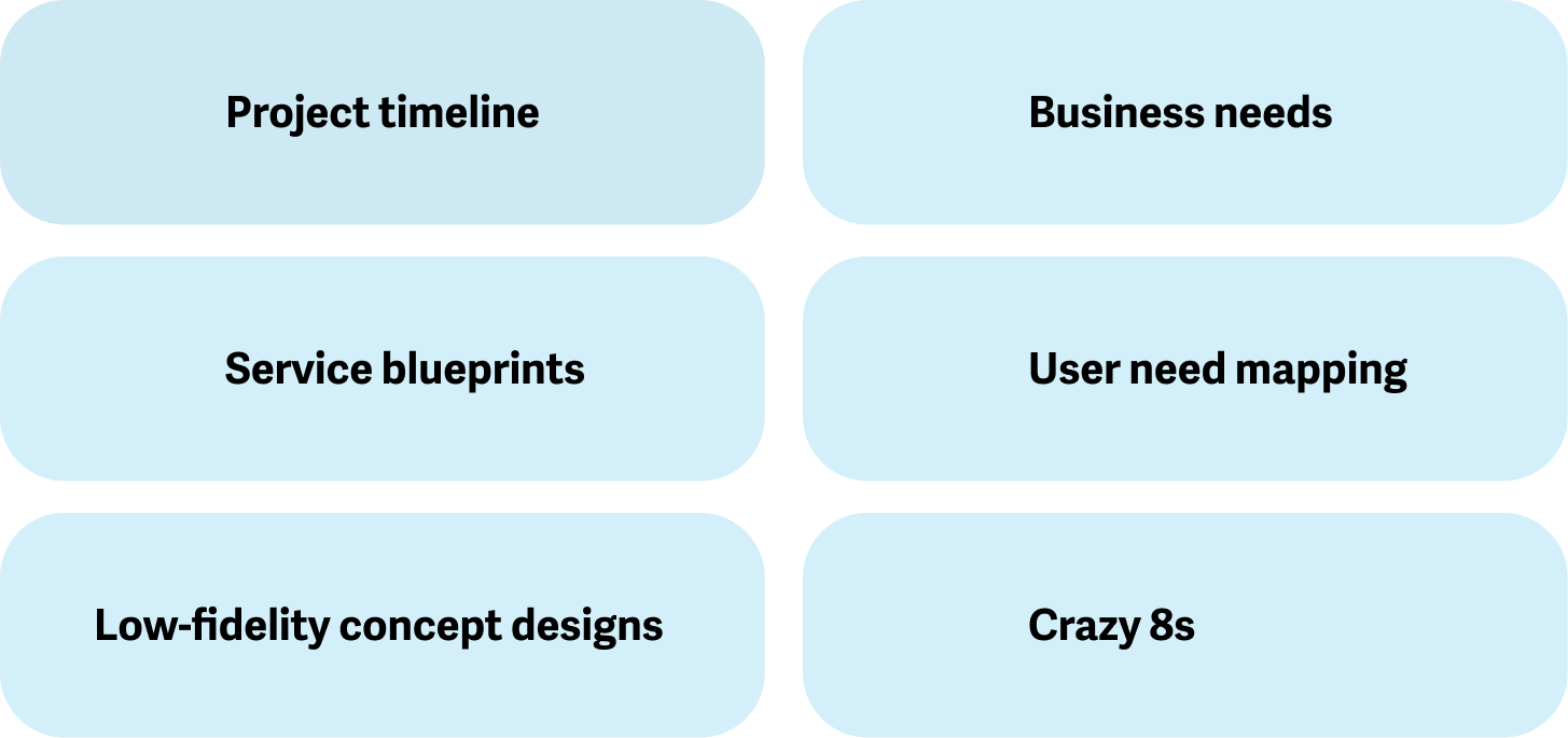
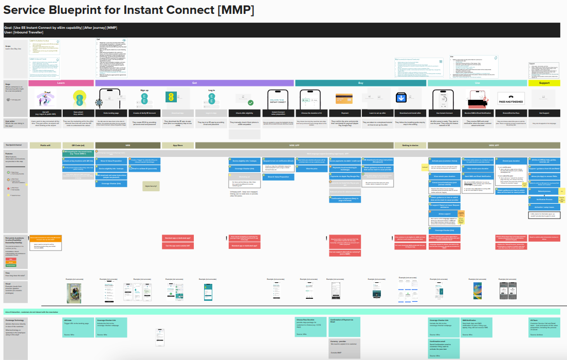
The service blueprint for the proposed user journey.
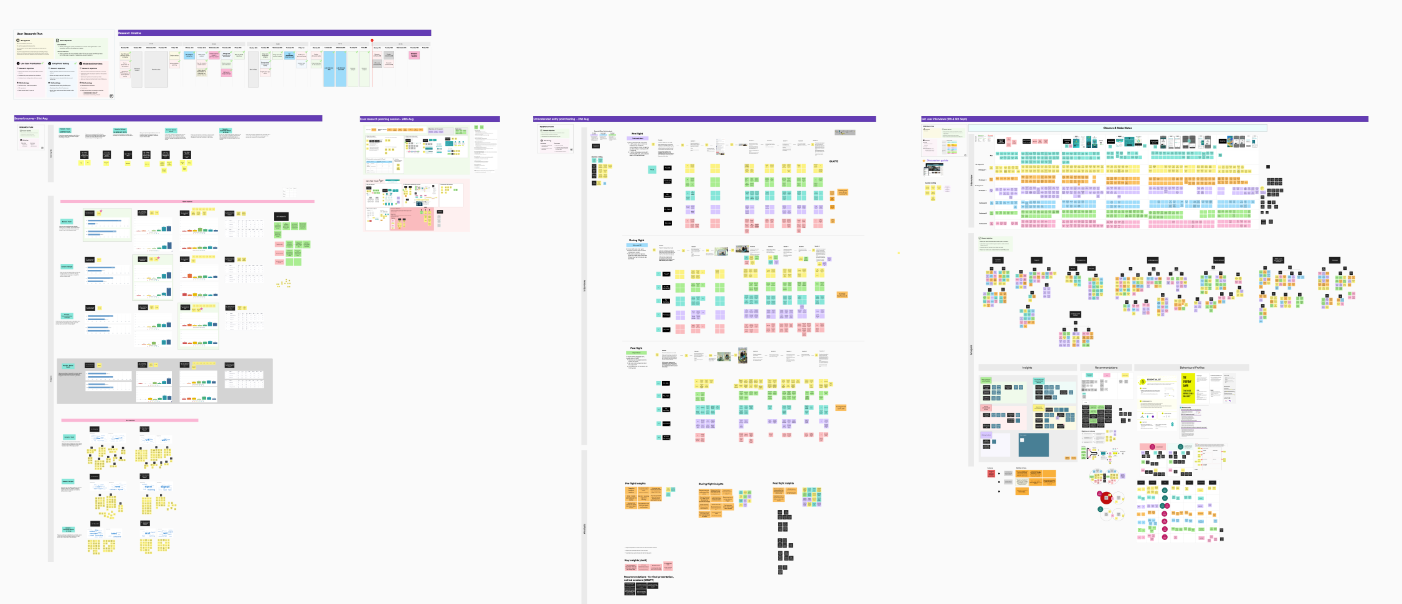
A birds-eye view of some of the discovery that went into this project.
User Testing
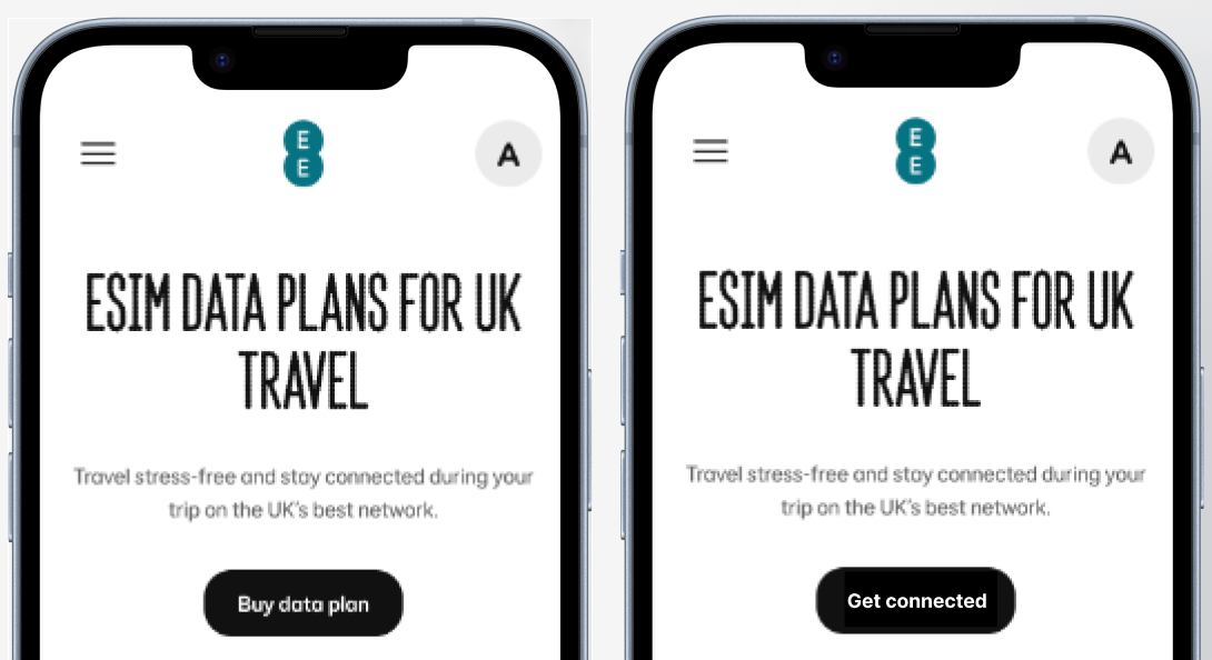
Once I had the first iteration for the landing page, we recruited participants who fit the project's user base: non-UK residents who travel globally, frequently.
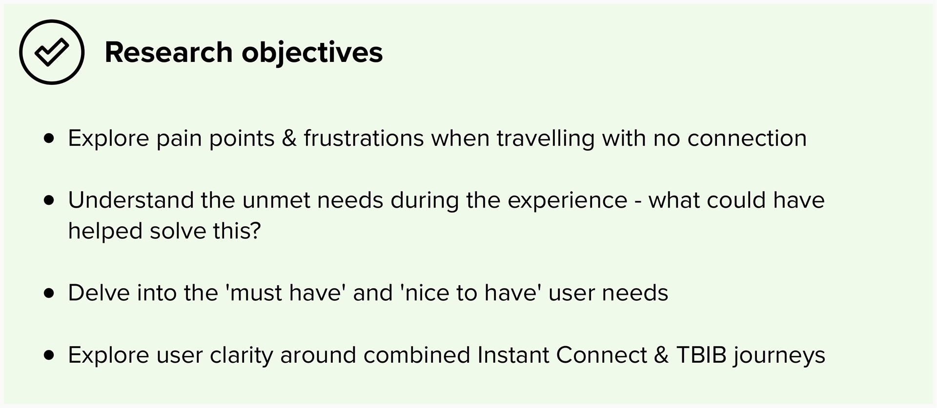
The initial user testing session was to understand user comprehension of the proposition itself, while understanding more about any needs we may have missed.
Thankfully, the initial design worked well, and users understood the concept of a data travel SIM.
One interesting finding was the tone of voice: the initial CTA said 'get connected', which became apparent that this wasn't clear for some users what this meant. This was a clear indication to change the cta to a simple 'buy now'.
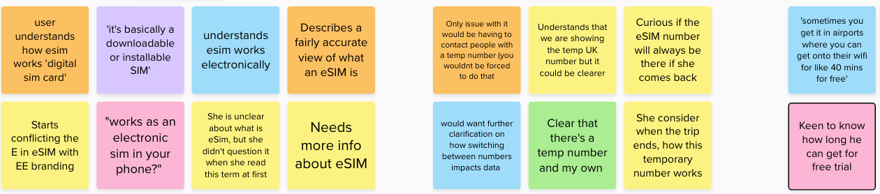
A snapshot of user findings.
Design
Once I user-tested a low-fidelity design with users, I took away the learnings and iterated the design.
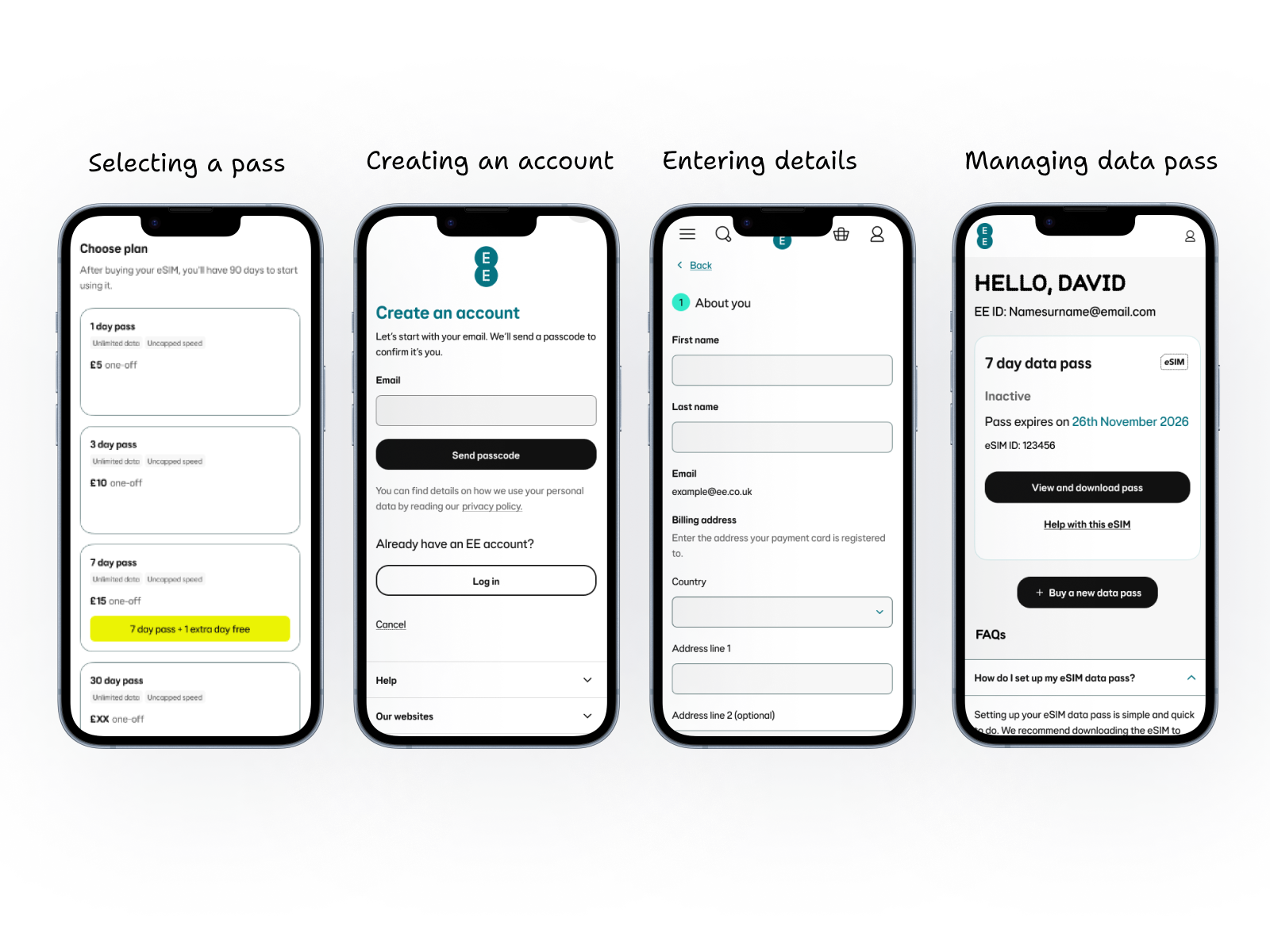
Design
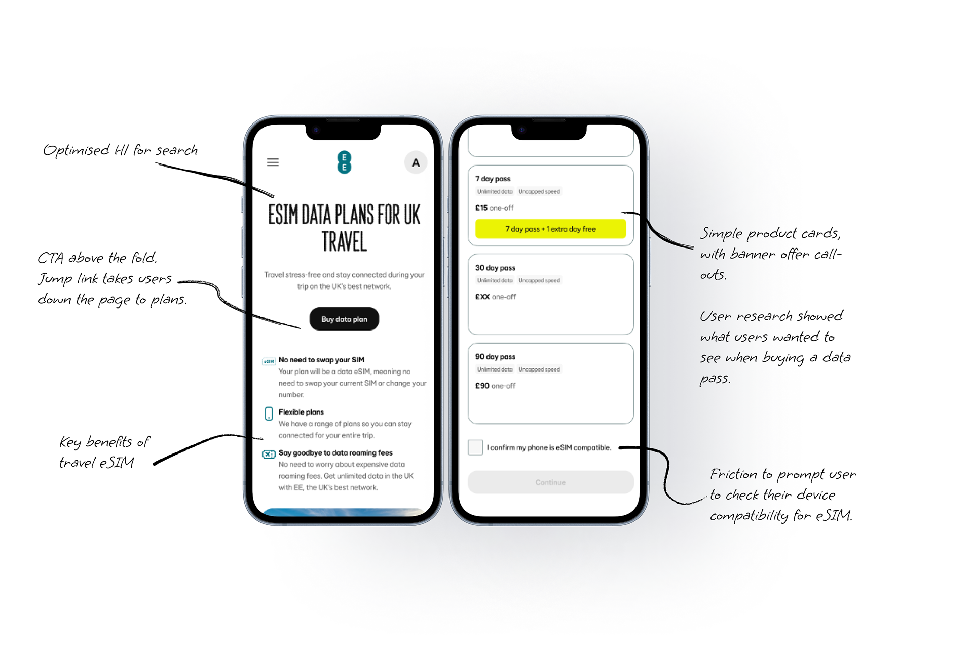
• SEO friendly heading, targeting keywords such as 'eSIM and 'data plans'.
• CTA with an anchor link to take the user to the travel passes.
• Highlight what the product is along with its benefits.
• Travel passes available for the user to browse, select, and check out with.
• Friction: Compatibility checkbox to ensure users are aware that they need an eSIM-compatible device.
• Key marketing call out, showcasing to the user who might not be familiar with EE, that it's the best UK network.
• FAQs based on SEO research into travelling abroad and connectivity, and the proposition's functionality.